Saturday, June 28, 2014

Preliminary Critiques

Hey all, In the interest of getting a head start on the workshop we are going to offer some preliminary critiques for those who are interested.  To have your comp work critiqued just follow this process.  1) set up a blog just for this project 2) write a post containing a brief description of your chosen project and the images you wish critiqued. 3) post a link to your blog in the comment section of this post. Good luck!

Here is our first student critique, submitted by Chris Rossow.

The Mummy Reworked

Here are my thumbnails for Option #2. I chose to rework Universal's "The Mummy" from 1932. Having a hard time breaking away from compositions where the figures are centered in the page.

Hey Chris,  These look really nice!  My main critique is the same as we discussed before.  You are still focusing too much on drawing and not enough on design.  Remember to try and keep these to 3 values. that being said I think you are heading in a good direction, especially with the interesting camera angles. Another crit I would have is they feel a bit dated.  Try to update the aesthetics a bit more, you are be a little to loyal to the original.  Remember, these need to be re-invented for a more contemporary audience.  Of course this can be tackled more in the tonal comp phase, but since you did a bit more drawing on these I thought I would mention it.  I will rework one of these thumbs over the weekend, and post it on Monday. Keep up the good work,
E-

Mummy Thumb 1

Mummy Thumb 2

Mummy Thumb 3


Mummy Thumb 4
Mummy Thumb 5

Mummy Thumb 5 Marker

Monday, June 23, 2014

EDIT Putting the "Camp" in Boot Camp


EDIT:  One of the local boot campers, Brian Knox, has offered to put up as many as 5 people.  He lives about a half hour drive from the Atelier and can provide transportation as well.  If you are interested contact me or Brian at briankingofearth@gmail.com first come first served.

Are you traveling from out of town for the Boot Camp?  Would you like to cut your expenses a bit?  Are you afraid of sleeping alone? Would you like to put a little more "camp" in boot camp?

Drop me an email at emgist@erikgist.com or post in the comment section of this post and we will try to get you together with other like individuals to share a hotel room.

Wednesday, June 18, 2014

Illustration Bootcamp Schedule


Hey all,
Here is the daily schedule for the workshop.  This is pretty much the way things will go.  We do reserve the right to make some changes as necessity dictates, but will stick to this as much as possible.

Thursday the 17th
8-9 am meet and greet
9-1 opening critique
1-2:30 pm Lunch
2:30-3:30 First lecture Lucas on “The Art of Thumbnailing”
3:30-5:30  getting started (materials, projecting, maybe a photo shoot demonstration)
5:30-7 dinner
7-10 drawing from the model (drawing demo Erik) (we can keep getting set up during this time)

Fri 18th
8-10 am open studio time
10-1 "1 on 1 help"
1-2:30 pm lunch
2:30-4:30 painting demo (Erik monster portrait)
4:30-5:30 lecture (Mike photo reference)
5:30-7 dinner
7-10 drawing/painting from model

Sat 19th
8-10 am open studio time
10-1 "1 on 1 help"
1-2:30 pm lunch
2:30-4:30 painting demo (Lucas dragon/creature)
4:30-5:30 Lecture (Erik storytelling)
5:30-7 dinner
7-10 Open studio/ "1 on 1 help"

Sun 20th
8-10 am open studio time
10-1 "1 on 1 help"
1-2:30 lunch
2:30-5:30 painting demo (Mike armor)
5:30-7 dinner
7-10 Open studio/ "1 on 1 help"

Mon 21st
8-10 open studio time
10-1 "1 on 1 help"
1-2:30 lunch
2:30-5:30 painting from the costumed model (Lucas Demo)
5:30-7 dinner
7-10 Open studio/ "1 on 1 help"


Tues 22nd
Final Day!  Last chance to get help from one of the instructors, and finish your illustration.

Monday, June 16, 2014

Materials: Michael C. Hayes


Sorry for being a little late to the party with my blog posts.  I just got back from doing two comic conventions back to back and just haven’t had the time.  I’ll be putting together a step by step post of my working progress in a few days.

As far as materials go, Lucas and Erik covered most of what I use, so I will cover a few things that I do differently.

Paints.   

I like to mix things up constantly.  I am constantly trying out new colors that seem interesting and adding them to my palette.  Whenever I hear another artist talking about a colors they like I usually go buy a tube and give it a go.  It’s not that I am searching out some all powerful, secret of the masters, pigment that is going to open up the clouds of heaven and turn all my paintings into solid gold.  I just like to experiment,  I find it keeps the painting process fresh and interesting.

At the moment this is my core palette that I use for most paintings: 

Titanium White (Winsor & Newton)
Ivory Black (Winsor & Newton)
Naples Yellow Light (Rembrandt)
Yellow Ochre Light (Rembrandt)
Cobalt Blue (Winsor & Newton)
King’s Blue (Rembrandt)
Mars Violet (Holbein)
Ultramarine Violet  (Rembrandt)
Manganese Violet (Gamblin)
Cadmium Red Light (Rembrandt)
Cadmium Orange (Rembrandt)
Cadmium Yellow (Winsor & Newton)
Greenish Umber (Rembrandt)
Transparent Maroon (Winsor & Newton)  *
Payne’s Grey (Winsor & Newton)
Transparent Brown Oxide (Windsor & Newton)  *(a richer Burnt Umber that doesn’t kill colors as quickly)
Raw Sienna. (Winsor & Newton)

From there I tend to add in some of the following colors, depending on the overall color scheme of the painting.

Alizerin Crimson (Gamblin)  *
Chromatic Black (Gamblin) *
Cadmium Red (Winsor & Newton)
Winsor Violet dioxazine (Winsor & Newton)  *
Magenta (Winsor & Newton)  *
Carmine (Rembrandt)
Terra Rosa (Winsor & Newton)
Cobalt Violet  (Rembrandt) *
Indanthrene Blue (Rembrandt)  *
Ultramarine Blue (Winsor & Newton)
Manganese Blue Hue (Winsor & Newton)  *
Prussian Blue (Winsor & Newton)  *
Blue Turquoise (Rembrandt)
Cobalt Turquoise (Winsor & Newton)
Pthalo Blue, Green and Turquoise (Winsor & Newton)  *
Terra Verte (Rembrandt)
Sap Green (Winsor & Newton)  *
Cadmium Yellow Light (Winsor & Newton)
Cadmium Lemon (Winsor & Newton)
Brown Pink (Holbien)  *
Transparent Red Oxide (Rembrandt) *
Transparent Orange Oxide (Rembrandt)  *
Transparent Yellow Oxide (Rembrandt)  *
Indian Yellow (Winsor & Newton)  *
Yellow Ochre (Rembrandt)
Lately I have been trying Gamblin’s assortment of Portland Greys as well.  I am still on the fence with them.

*denotes a good glazing color

By no means would I expect anyone to purchase all or any of these paints. (In fact I would recommend most people go with a simpler, more structured palette like Erik or Lucas)  But I will bring everything in to the workshop and leave them out for anyone that wants to try anything.

Brushes. 
I use almost exactly what Erik uses, with the addition of:
Grumbacher Goldenedge # 1-4 flats  for architecture, mountains, rocks or anything with a sharp, planar quality to it.  (I take good care of them, but still manage to go through them pretty quickly.  Once they lose their sharp, chisel point, they aren’t nearly as useful.
Silverbrush Silverwhite 1503s #8 filbert.  This is my “cheap, take a beating brush”  that I use for mixing large bunches of paint on my palette, applying paint to large areas, scumbling and glazing.  (I go through these pretty quickly as well.  But that is the point, they are a cheap brush I used to for rougher work to take the burden off my other brushes)
Langnickel Mini Majestic  20/0 fan brush for fine blending/smoothing small areas

Mediums
I prefer Gamblin Galkyd Lite and Galkyd slow dry.   If I need something to dry faster,  I have a few tubes of Winsor & Newton  Fast drying Alkyd paints I will mix in (sparingly)
I use Gamsol to rinse my brushes and Dr. Bronner’s soap to clean them.


Wednesday, June 11, 2014

Materials: Lucas Graciano

These are the material I use.  Erik and I each use some of the same things. I may just expand a little on what he's said and talk about some of the mandatory vs optional materials you'll need for the workshop.


Paints:  Like Erik I use mostly Windsor Newton. I highly recommend using the professional grade oil paints.  Windsor Newton has a student grade series called Winton - stay away from these.  They are less expensive, but the trade off is you end up having to use more of it when mixing colors for good results.  There is more pigment in professional grade paints, allowing you to use less of it for more.

From upper left going clockwise: Titanium White, Ivory Black, Cad Lemon, Cad Yellow, Yellow Ochre(Da Vinci), Cad Orange, Cad Red Light (Da Vinci), Burnt Sienna, Burnt Umber (Winton....I'll explain in a bit), Transparent Maroon, Viridian, Permanent Green, Sap Green, Ultramarine, Pthalo Turquoise, Coblat Blue, Manganese, Magenta, Alizarin.

As far as that Winton - Burnt Umber goes, I know I said "No Winton".  This is the one exception.  I don't mix my burnt umber with my other paints.  I use this color for my under-painting, sometimes.  I like this burnt umber because it's a nice warm burn umber.


Brushes:  I use a variety of pallet knifes, generic large flat bristle, Robert Simmons "Signet" a range of sizes from 2-8 of each flats and filberts.

The next set of brushes is a mongoose hair brush called Langnickle: large size brite Langnickle,  a mixture of brite and flat Langnickles sizes 2-10, small round Robert Simmons "white sable" sizes 0/3-0.  Langnickles are no longer available, but Erik mentioned some good alternatives below.


I use a few different mediums.  Gamsol for cleaning and thinning, Linseed Oil for thinning, and Liquin for faster drying and those tight deadlines.


Misc: 2 jars holding mediums, Master's brush soap(in place of this I use Dr. Bronner's soap), tube wringer, pallet scraper, airtight container, shop towels, mahl stick, and a reference holder called a Manfroto.


Other Misc:  Pallet and paint tray.  The tray will give your colors a few extra days from drying up.  You can also use disposable freezer paper from the local grocery store to tape to the top of our school table easels.  This might be the most convenient for those of you traveling.


This is a shot of my pallet.  Its a custom glass pallet.  I arrange my colors clockwise in a warm to cool arrangement.


Here is what you'll need:

Mandatory:
-Assortment of Colors
-Assortment of Brushes
-Pallet
-Gamsol in airtight container
-Paper towels
-whatever surface you decide to work on
-pallet scraper
-brush cleaner

Optional:
-mahl stick (we have plenty at the school)
-tube wringer
-manfroto
-tape
-pallet knife
-paint tray


*Feel free to ask any questions, and one of us will respond in the comment section below.

Monday, June 9, 2014

Materials: E. M. Gist

Here are a list of materials I prefer for my finished studio paintings. The ruler is in there for scale, though I do use one as a mahl stick from time to time.

My pallet: all Winsor Newton brand unless otherwise stated
cadmium lemon, cad yellow, cad yellow orange, cad orange(Gamblin), cad red light(Da Vinci), magenta(Old Holland), transparent red ochre(Le Franc), winsor violet, french ultramarine, cerulean blue, viridian, ivory black, titanium white(Da Vinci)


My brushes:
I use a large 2 inch Robert Simmons synthetic sable flat, Robert Simmons Signet bristle filberts ranging in size from 2 to 10, and Langnickel or Rosemary mongoose brights  (a good affordable substitute are the Princeton 6600 Filberts) from 2 to 10, Robert Simmons synthetic sable rounds 1 to 3.


My mediums/thinners:
To add viscosity and speed the drying time of my paints I typically use Liquin Fine Detail. To cleanse my brushes while painting and to cut the Liquin I use Gamsol.


Misc:
Moving clockwise from the upper left, a small container for my Liquin, a paint ringer for salvaging, the remnants in my paint tubes, cotton swabs for working with thin paint, a medium size container for my Gamsol, paint scraper for cleaning my pallet, shop towels, old masters brush cleaner for cleaning my brushes at the end of the day, and in the middle a pallet knife.


Most of these materials can be purchased at any decent art store.

I will do a separate post on how I prepare my painting surface, but in the mean time I use gessoed hardboard.


Friday, June 6, 2014

Bootcamp Assignment Options

Hey all,

If you are already signed up for the bootcamp (or just want to play along at home) choose at least one of the sample assignments listed below, and try to come in to the first day of the bootcamp with as much of the following ready for critique as you possibly can.  The more prepared you are the better chance you will have to complete the project in the six day we have together.  This being said, we understand that people are coming from a variety of experience level, so work to your comfort level and we will be there to guide you in taking your work to the next level.  Please try to have thumnail (rough) sketches, reference photos, and a tighter sketch ready to go.  Along with your preferred painting surface and materials.

Project Descriptions

Option 1:  "To The Rescue!"
                  Standard book cover dimensions you can work any size that you feel comfortable as long as it is roughly a 0.75:1 vertical (approx. 18 x 24 portrait) format
                  Illustrate a traditional medieval fantasy scene, where we show a warrior rescuing a damsel (or dude-sel), being sacrificed to a dragon.  Pick a point in the scene which to tell your story, right before the action, in the middle of the action, or maybe even the warrior escaping with the rescued character.  Pick a culture that dominates the design aesthetic of your characters' clothing/ armor.  See if you can even design a dragon that reflects that culture's aesthetic. For example: if the scene takes place in an Asian themed setting, design a dragon that the audience can recognize as Asian influenced.

Option 2: "Oh The Horror!"
                Again work to a comfortable scale, could be either standard book cover 0.75:1 vertical or cinematic ratio 1.85:1 horizontal (24 x 13 horizontal)
                Illustrate a scene from a classic horror novel or film, but re-imagine it as if you are the director or cover artist.  You pick the camera angle, lighting, and even redesign the characters to fit your personal aesthetic.  Pick something from at least 30 years go and try to make it appeal to a contemporary audience.

Option 3: "Angelic Protector of the Blinding Dawn"
                Work to a scale you are comfortable, standard MTG card art dimensions 1.33:1 landscape (approx. 12 x 9 Horizontal)
                Show a majestic female angel dressed for battle in the attire of your choice. She must convey a sense of protection,not aggression. "Blinding Dawn" may be conveyed literally through the time of day, shown with insignia, or implied creatively in another fashion.

Feel free to post any questions in the comments below.

Dragon Queen Step X Step

Welcome everyone to the blog!  I'm looking forward to meeting each of you at the workshop.  Following in Erik's footsteps, here is my process.  This painting was done for a Magic the Gathering event promotional image in Mexico City.  The only parameters I was given was the image had to reflect the culture, have a dragon and a woman in it, and have the same dark fantasy style that Magic the Gathering has.

Dragon Queen Step x Step

I first start off with loose sketches similar to Erik's approach, except mine are done digitally.  This allows me to to continue to manipulate one sketch until it works.  Scaling here, cropping there, I rework until it does work.  I may do this with 3-6 sketches until I find something I or the director likes.  Working digitally, I can get a relatively detailed sketch with full value pretty quick.


Once a sketch is approved by the director, I shoot and collect my reference, and start work on a tighter drawing, which usually consists of multiple layers of tracing paper.  I collect reference from all over, my own personal archives, magazines, and the internet.


I then transfer the image onto my surface via projector, then start my underpainting.  I don't always do an underpainting, but in this case I felt it would act as a good ground for a lot of the cools I was planning on putting in the painting.


I usually start with the focus of the painting.  This period in the process is when I 'm most excited about the project.  So I can give it my most energized and focused attention.  My hopes is that it will set a look and standard for the rest of the painting.


Inch by inch I apply and move around paint. 


After I get it to the almost finished point, I take one more pass all around. making subtle adjustments to the value and color through glazing, and adding the final details.  Once I shoot the image there is another level to the process where I bring it into Photoshop and make my last corrections to any distortions I may have gotten while shooting the image.


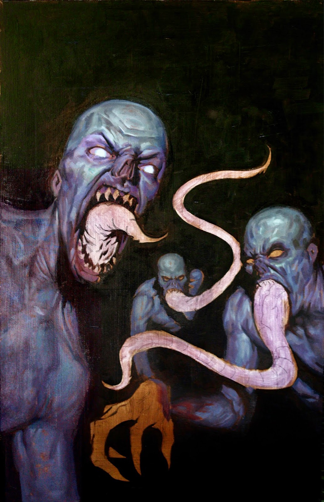
The Strain Cover Step X Step

When starting any new project the most important step is the idea iteration, or thumbnail phase.  The original idea for this cover was to illustrate a scene where the main characters have decided to shoot a viral video to expose the existence of the strigoi.  My first idea was to go quite literal, as it usually is.  I quickly deviated from that over the course of several more thumbs to a kind of first person "handcam" view, almost as if it is a frame from the viral video.  In the end this is the image we decided was best.


From here I shot some reference and moved onto the tonal comp.  This is the phase where I develop the idea further as well as work out and compositional subtleties that still need to be resolved.  I usually like to do these at least the 1:1 to the final print reproduction.


Then using either a projector, or carbon paper I loosely transfer the the image to my gessoed hardboard.  In this case 14 x 22 inches.


I then block in a 3 value underpainting.  I have recently been doing more full color underpaintings, but this one was more or less monochromatic using burnt umber ( with a bit of local color on the stingers, because I wanted a translucent effect in the final piece.


I then begin blocking in the general color feel very quickly.  For me this phase is very similar to alla prima painting from life.


On my next pass I establish an final textures and details.  More or less finishing areas off as I go.


Introduction

Hey everyone,
Welcome to the official blog of the Watts Atelier Illustration Bootcamp!  In the posts to come we will be introducing you to and giving you a glimpse into the processes of our three instructors, Lucas Graciano, Michael C. Hayes and E. M. Gist.  We will also be posting your three assignment options, and open up for any questions you may have.

Those of you who have already signed up we look forward to getting to know you over the next few week, and finally meeting you in person at the workshop.  Those of you who have not yet signed up, but are interested, follow these links to learn a bit more. Watts Atelier and a short interview by Imagine FX